01 Project overview
1040 Abroad
After years in the business of helping people with their taxes Olivier Wagner and his team partnered with Three.Design to transform their website and brand that supports their vision - a tax consulting company Inspired by the prospect of offering a better life to U.S. citizens who live in foreign lands, supporting trust and transparency for ordinary people that never knew about the lifetime of taxation they're bound to.
TLDR; The goal is to improve conversions and trust through a brand new designed website and visual identity.
02 Website analysis
Pain points
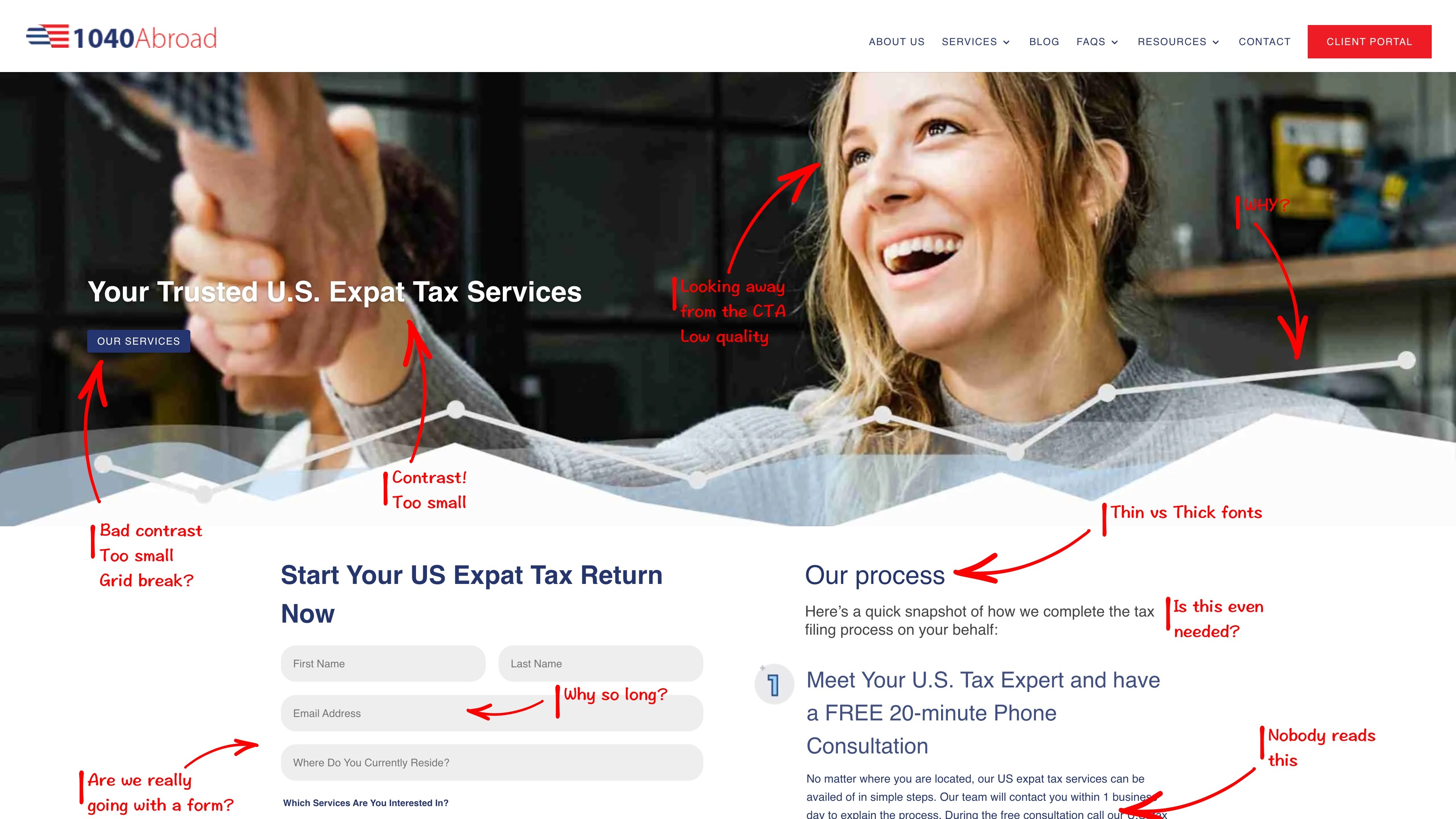
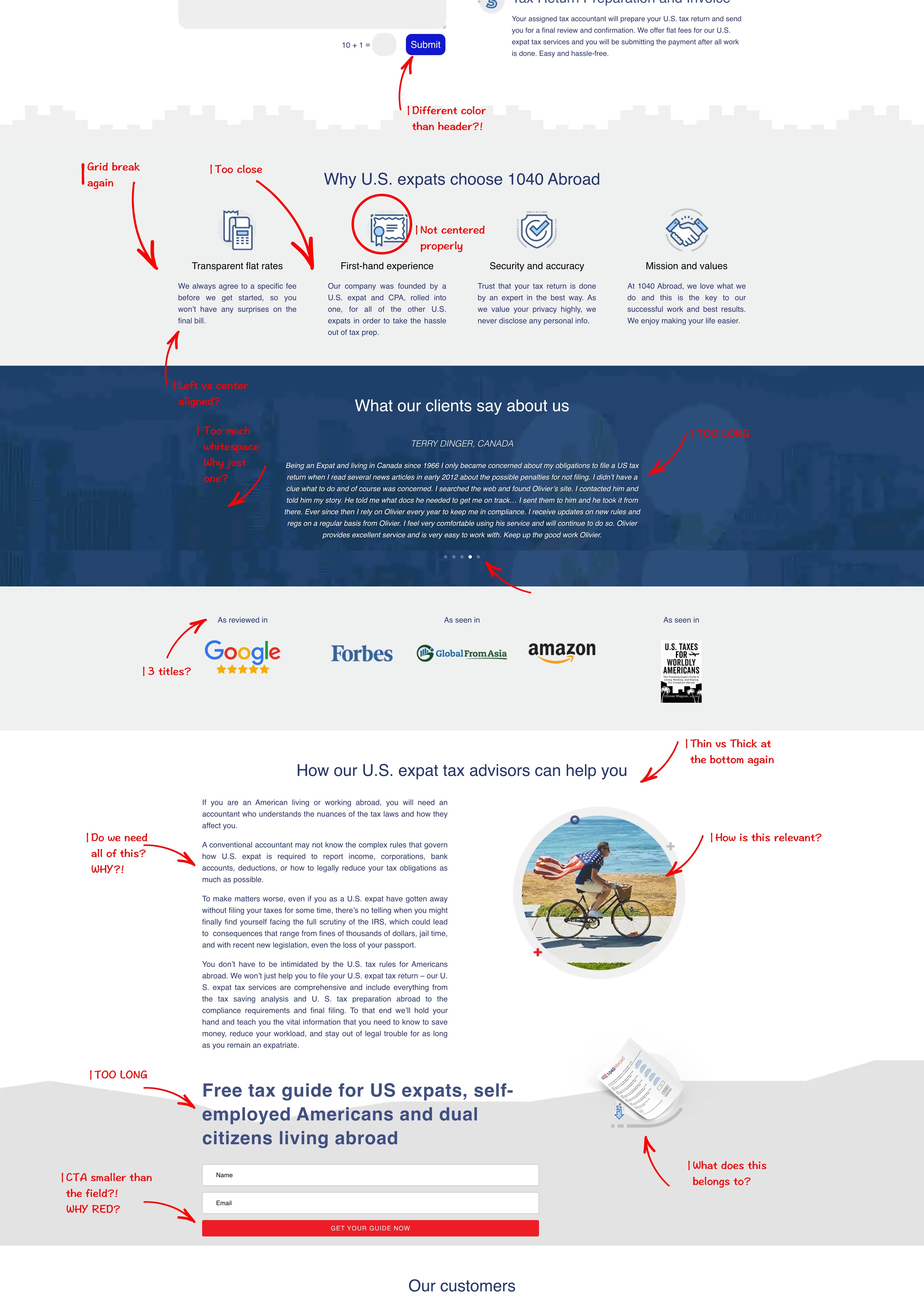
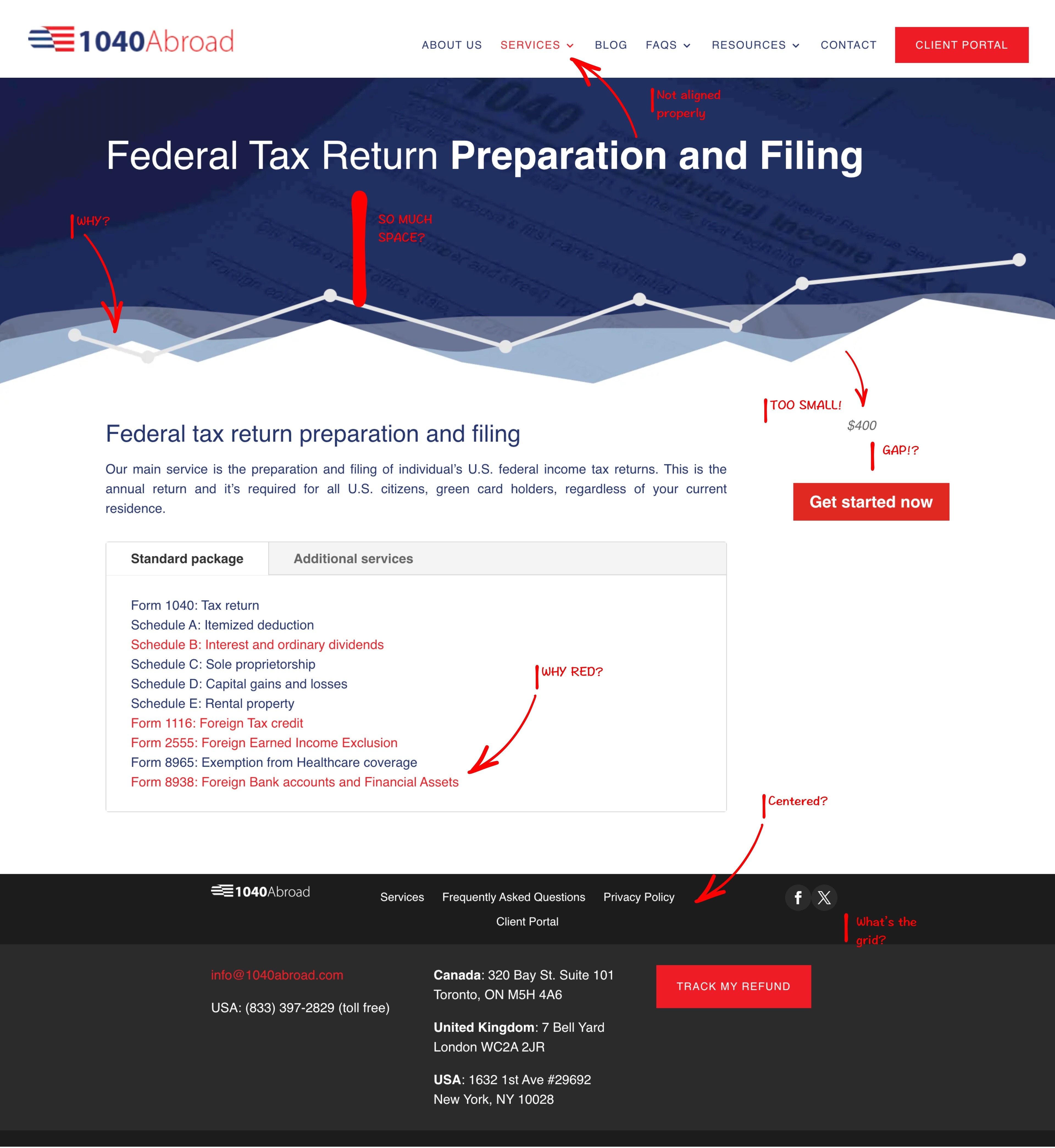
First thing we do, when it comes to a website redesign is to analyse the current website. Carefully look through it and make a lot of annotations to help us find the key pain points & also get to the "Why" some things are there.
When something was unclear to us, we just asked Olivier and his team a couple of questions, since they are the experts in their own field. Why is there a form? Do we really need a graph in the main header? What problem are you trying to solve with the redesign?
All of this helps us to understand the client needs, what problem are we trying to solve & does this make sense for the target market?
03 Old school exploration
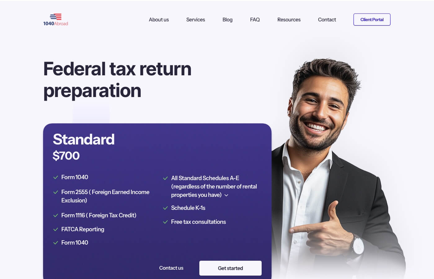
Header explorations
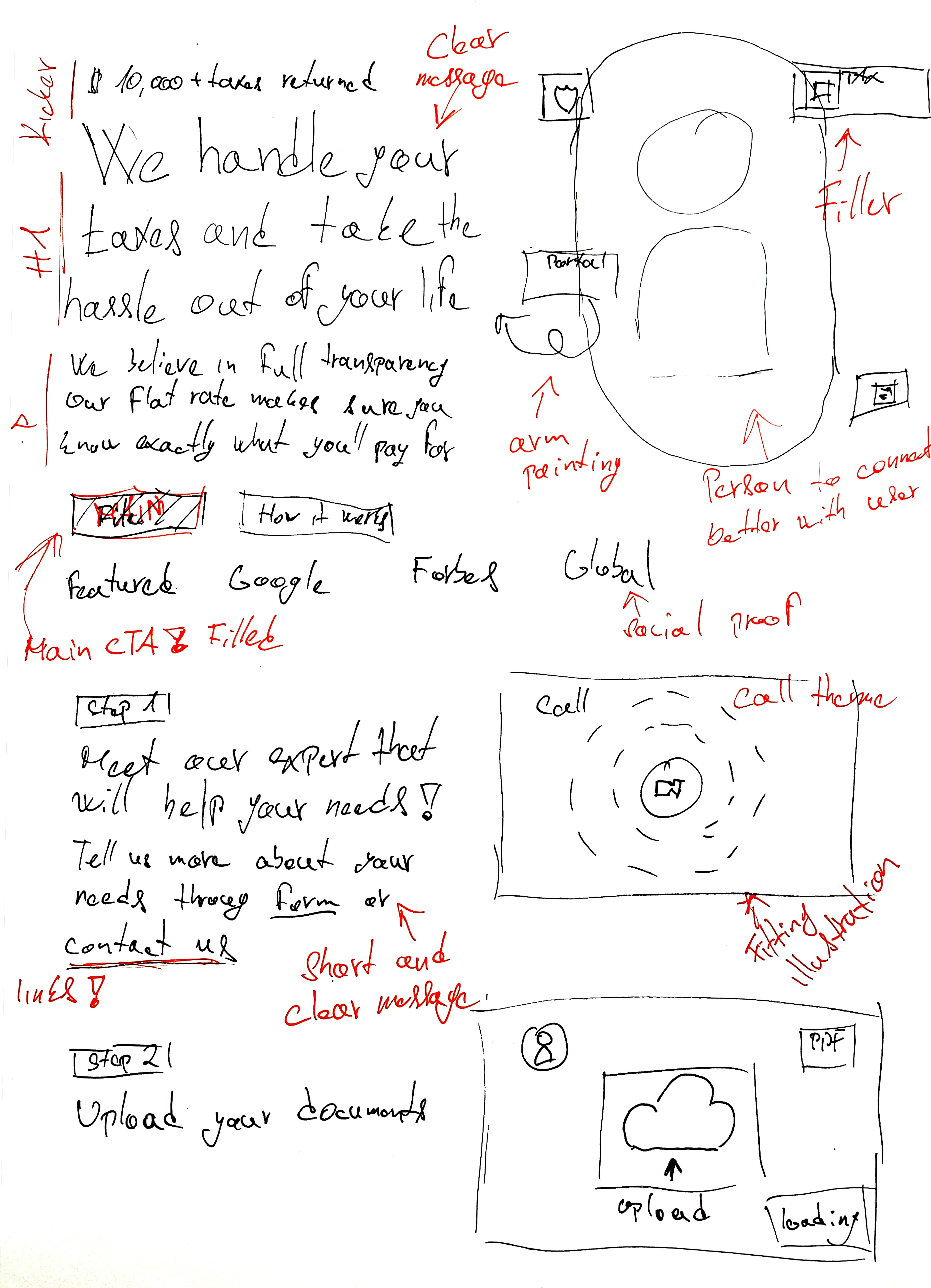
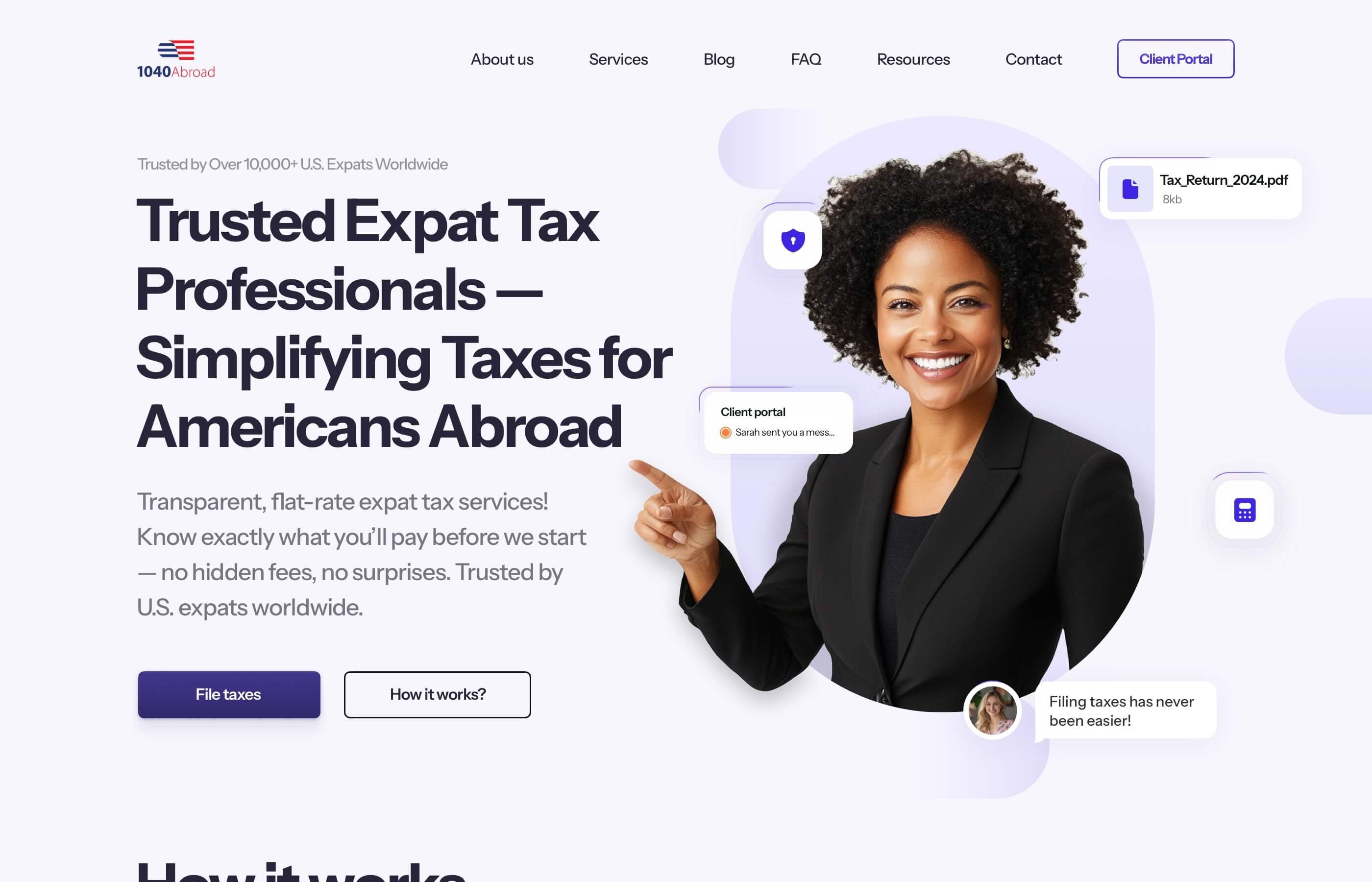
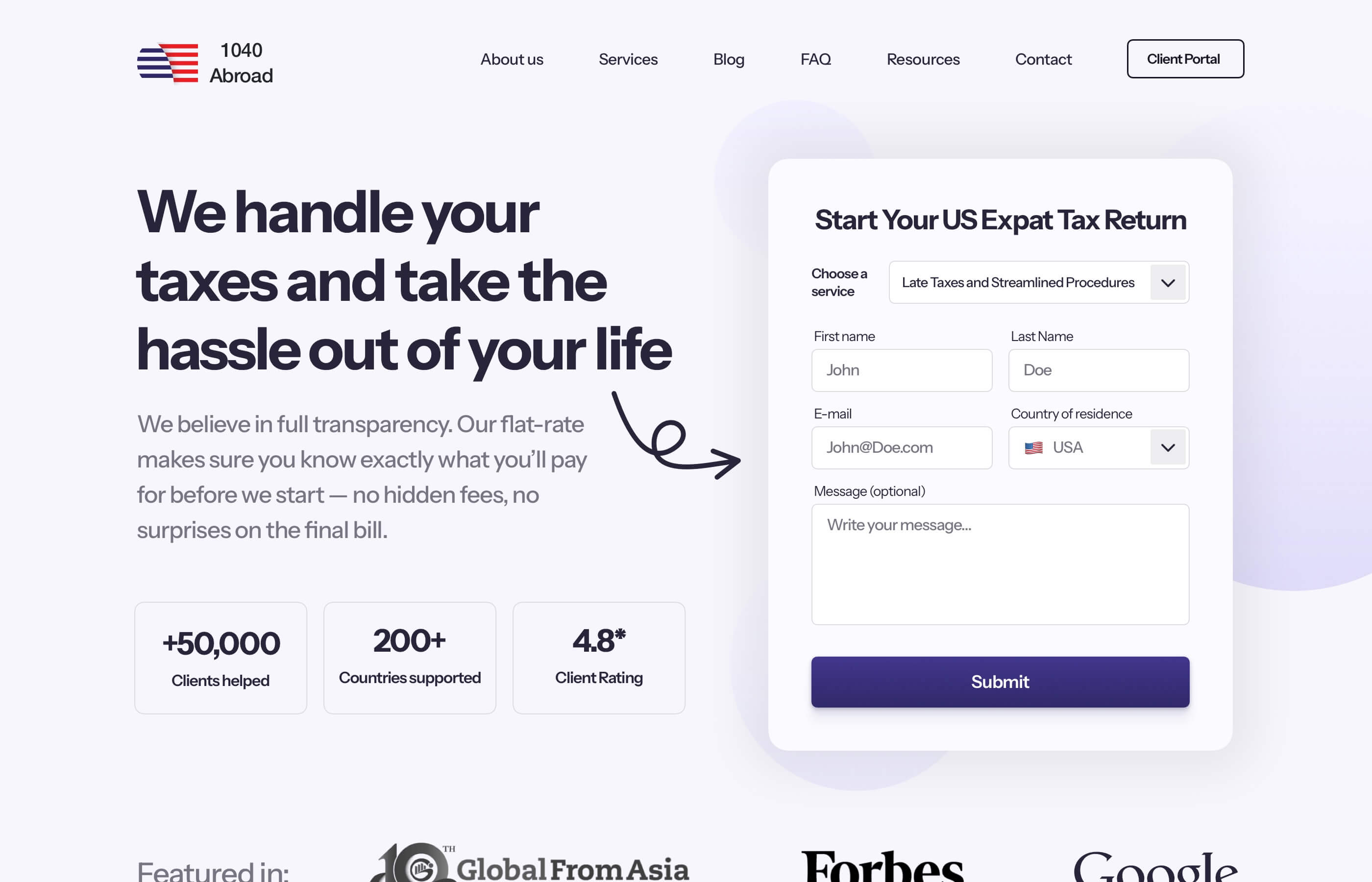
The header is the most important part of the website, it has to meet quite a few requirements in order to convert the user quickly.
That's why we always like to do more than just a one design of the header. It's important to explore the options and annotate the thought process for the client, alongside testing a different type of copy.
This allows us to craft a unique tailored header that solves a specific need for a specific industry.
A Header should:
• Have a clear 90% of the doubts
• Have a CTA that stands out
• Have a clear messaging
• Have a social proof to make it real
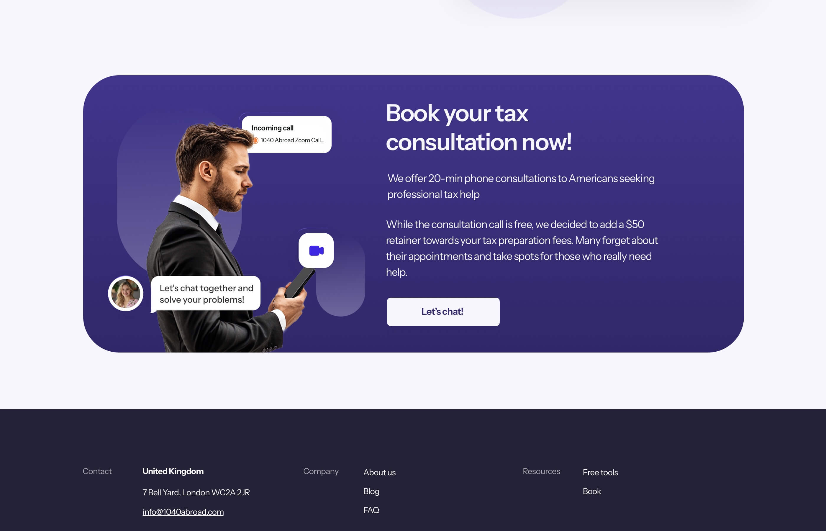
04 Iterations & Problem solving
Iterate & Combine
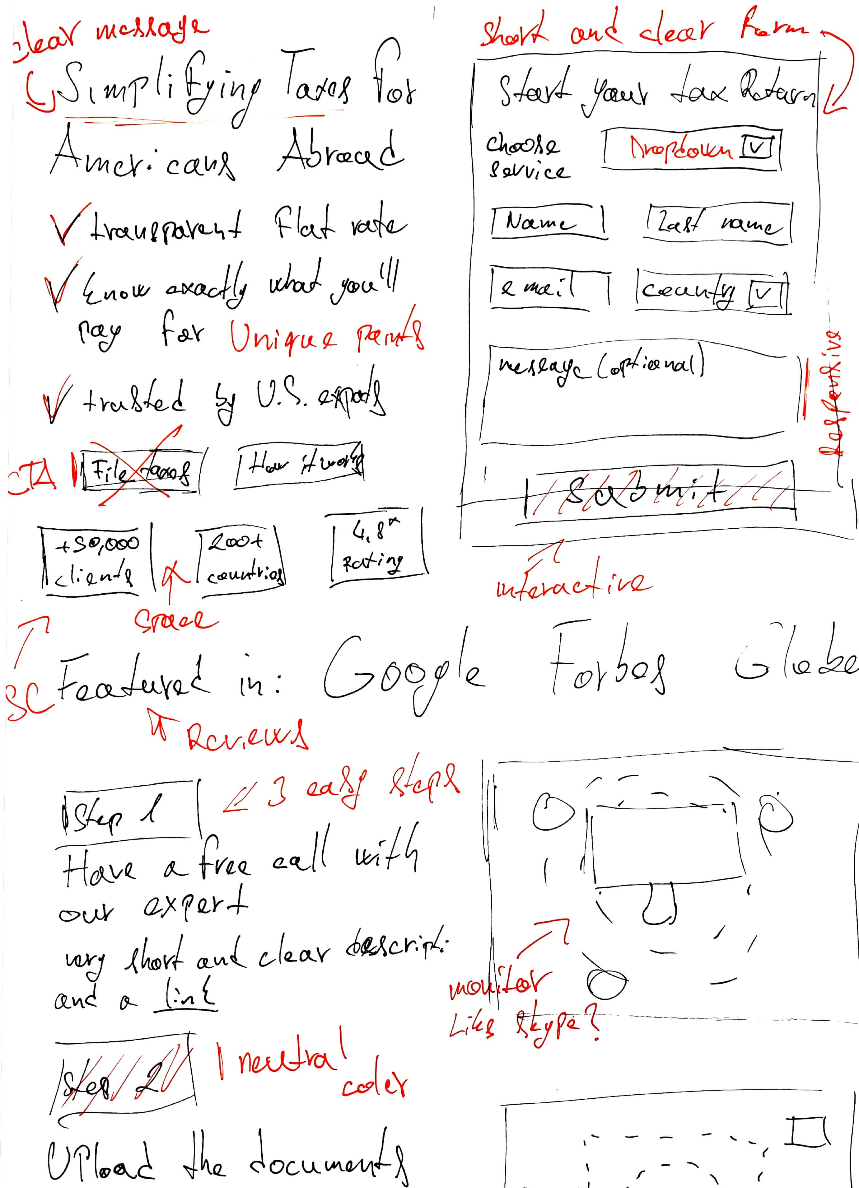
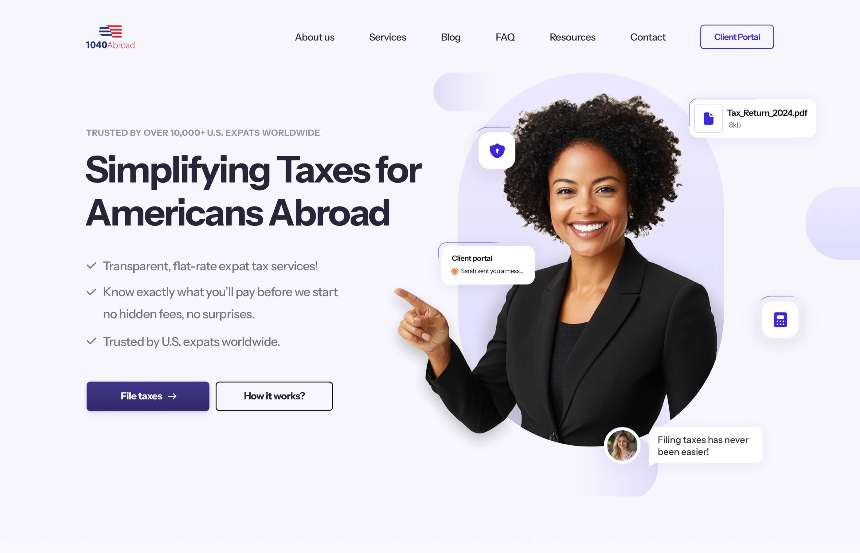
The header below took us 6 iterations before we were completely happy with the messaging, the image, the filled elements floating around balancing the whole experience, the unique points that are making 1040 Abroad stand out.
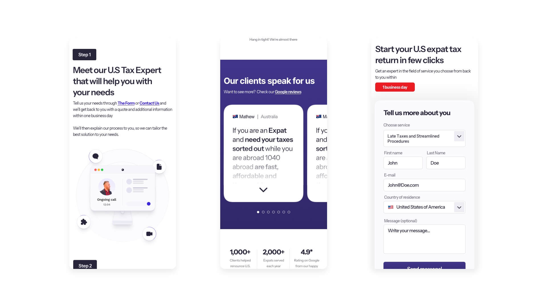
04 Iterations & Problem solving
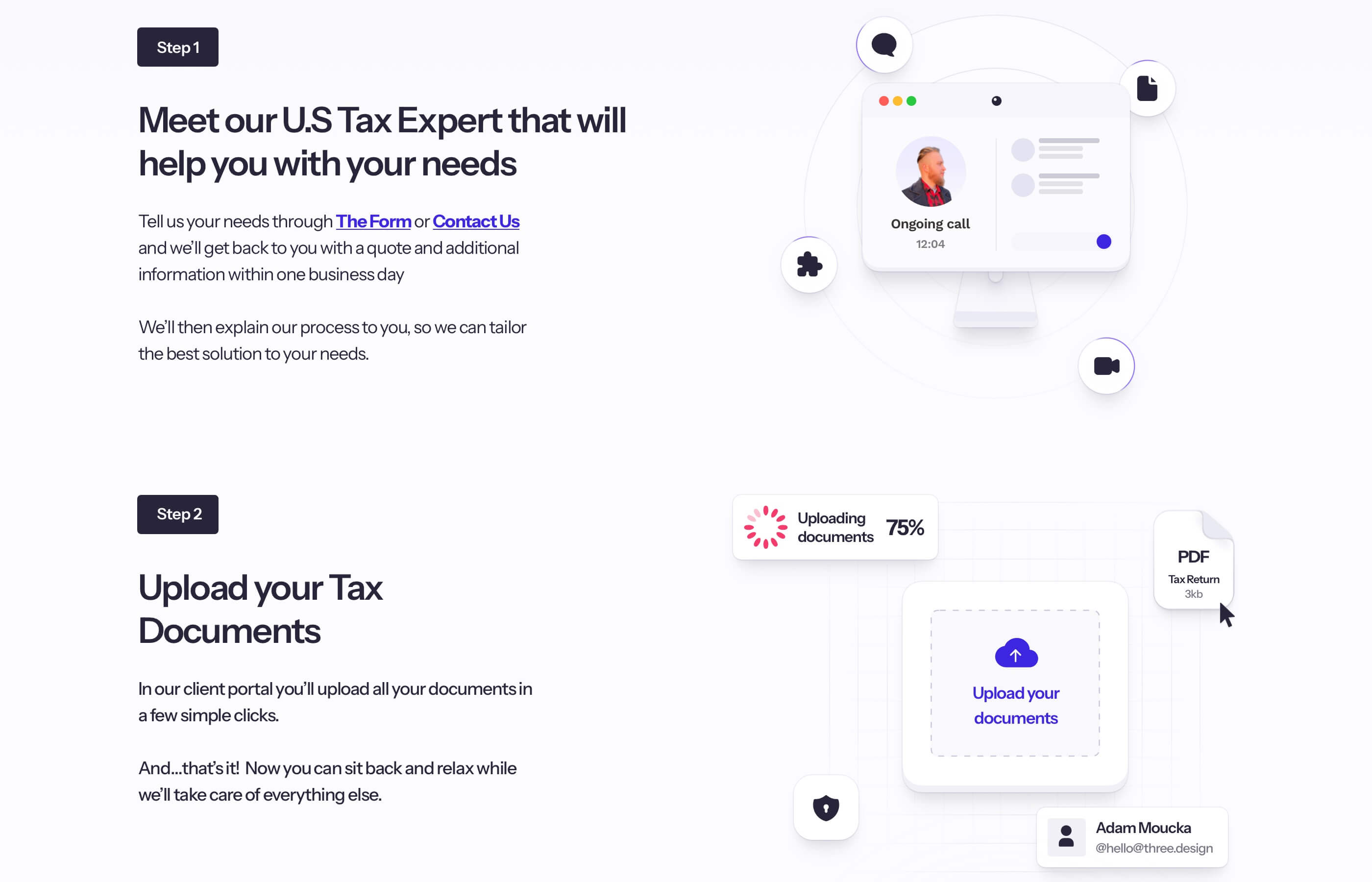
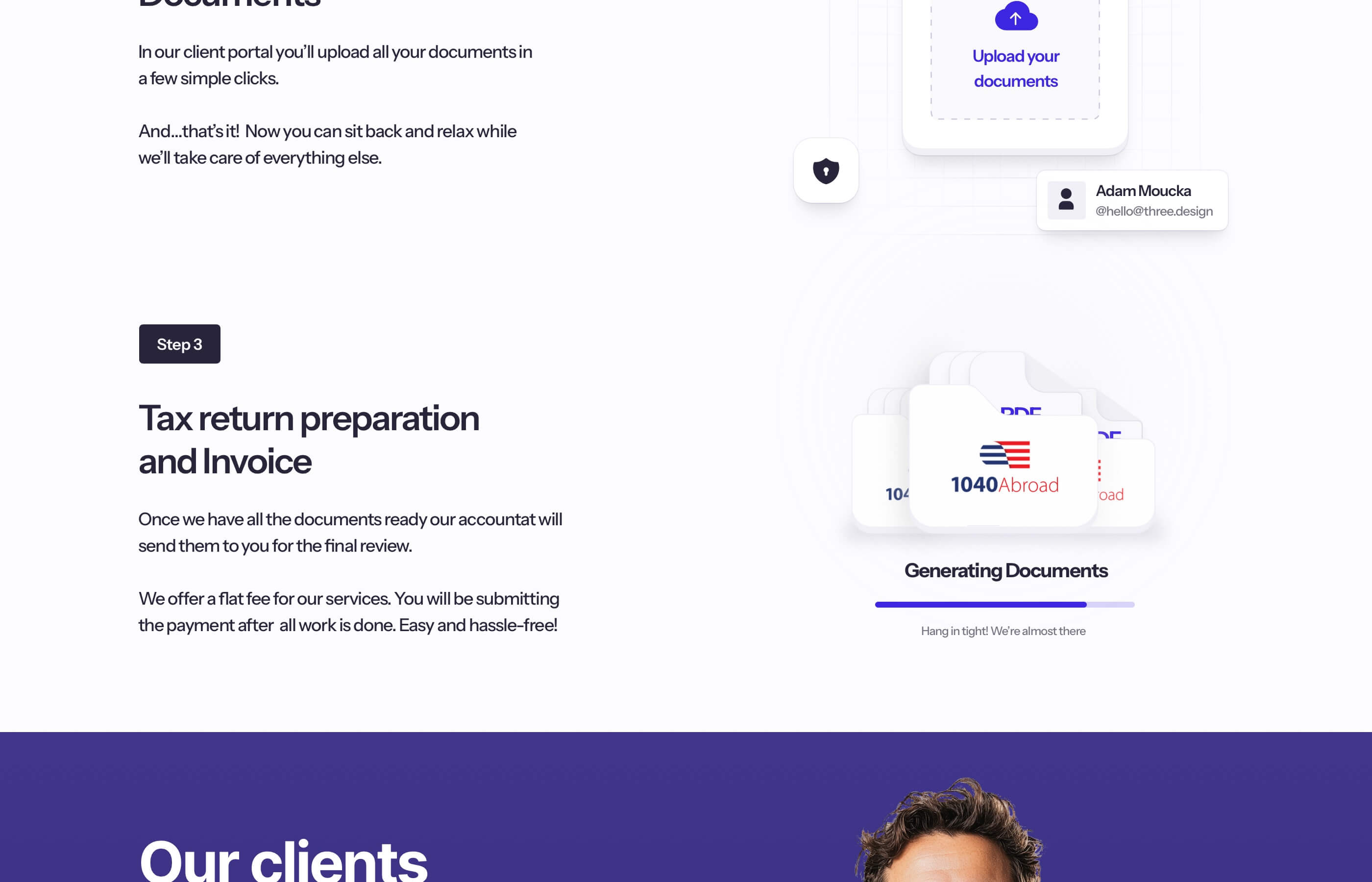
How it works
It was crucial to nail this section. The main goal of the section is to make it clear to the user how Olivier and his team operates.
By creating custom illustrations and connecting them to each step, we were able to achieve a smooth experience for the user that flows naturally, isn't overwhelming to read and quite easy to understand to every target audience out there.
04 Iterations & Problem solving
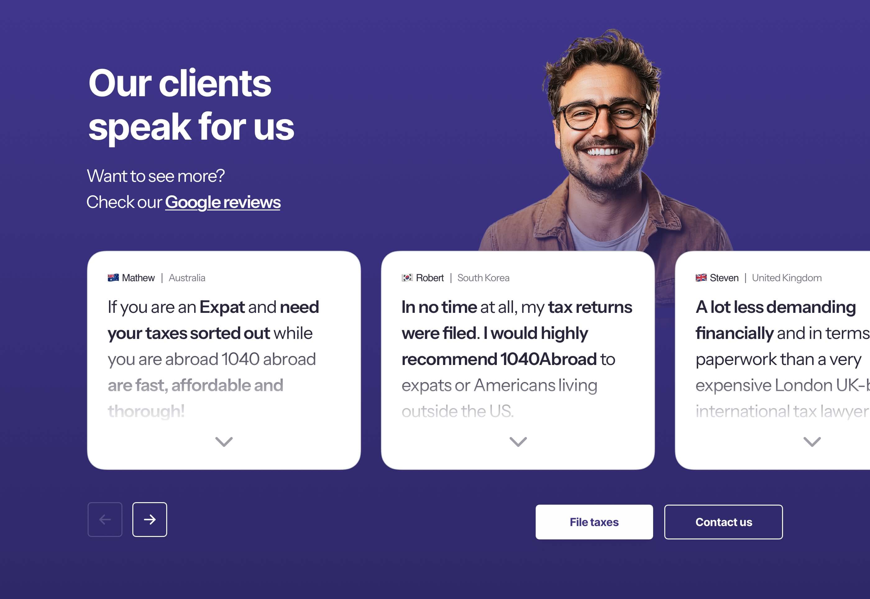
Social proof
The reviews from past clients were one of the pain points that we highlighted in our analysis. The main question was "How do we make the user to read them?"
Shortening the message and highlighting the main points of the review allows us to shift focus where we want it, and have more than one review in the view.
This allows the user to quickly see how Olivier and his team helped the individual with an option to "See more" of the review, without overloading the user with information.
And to make this section feel more "Alive" and less information heavy, we also added a person above the reviews, since we're in the business of helping U.S. Expats with taxes. This connects everything nicely on the psychological level.
Words from the client
"They've been absolutely amazing with our redesign. What stood out the most was how deeply they understood our niche which is very specific and doesn't follow the usual digital marketing rules. I highly recommend them!”
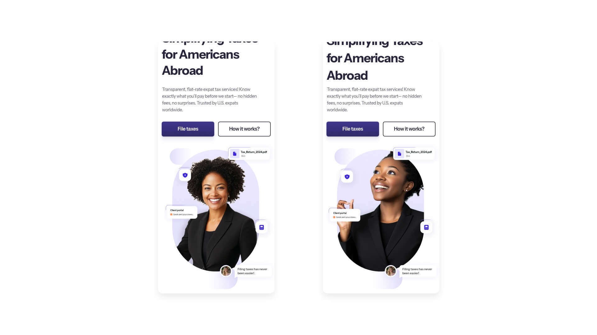
05 Tablet & Mobile breakpoint
The gaze principle
All of our designs come with a tablet and mobile breakpoint, but we do them differently. Mobile is it's own experience, it's not just taking the website design and scaling it down.
One of the key highlights we do when it comes to mobile is the gaze principle. People are naturally drawn to people, this is why we have a woman in the header, but how should the header look like when it comes to mobile?
This is where we step it up and redo the whole section. The person should be looking upwards to the main CTA so the user is naturally drawn to it.
You can compare it yourself, which version has a bigger chance to convert?
06 Branding & Visual identity
Enhancing clarity
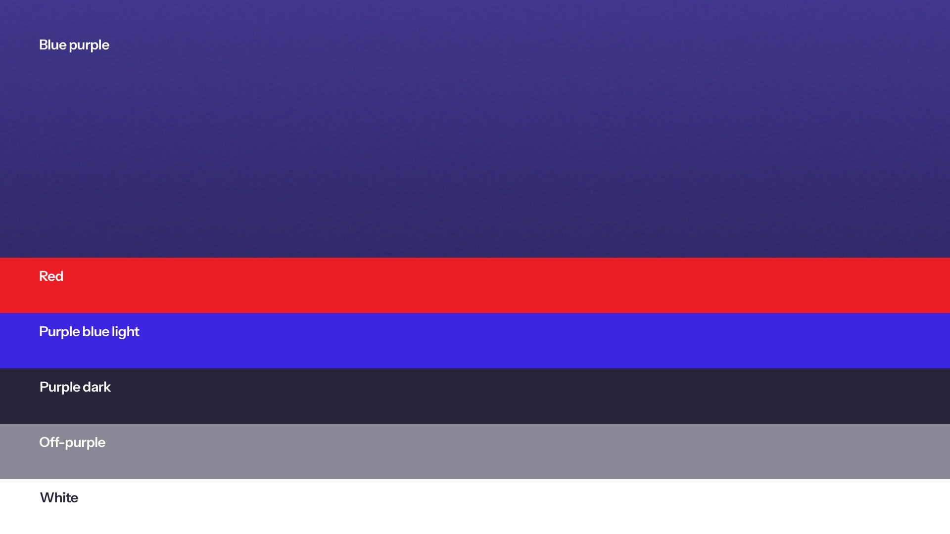
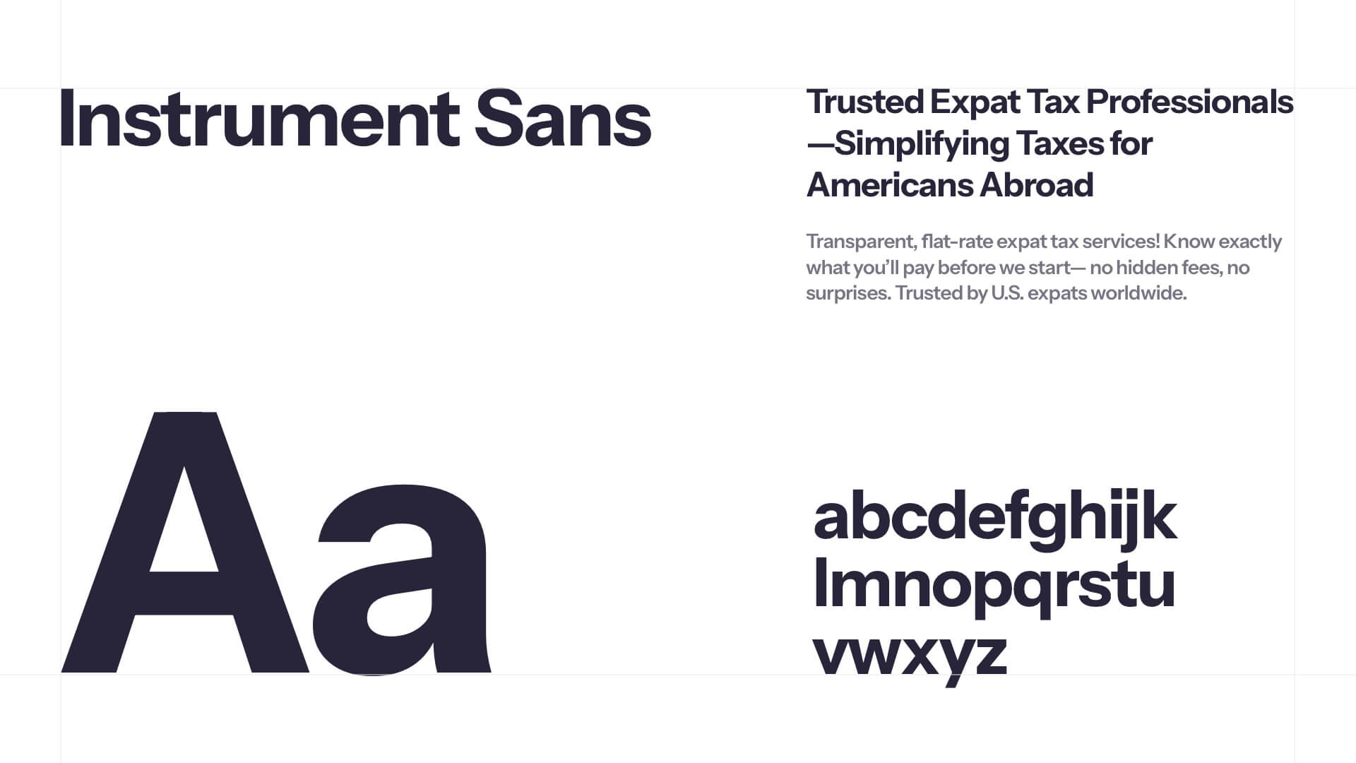
Nothing in the design should be random. Everything should make sense and be based on thorough research and years of experience.
With a redesign a new fresh look that connects with the brand emerges. We've refined the whole color palette. Adding a hint of purple into the primary color to evoke emotions alongside blue to bring trust into the brand.
Alongside a Font family change to fit the new professional but trustworthy & elegant look.
We've made sure that these changes comply with the standard WCAG contrast rules and are accessible by majority of the audience.